Virani Homepage Redesign

Overview
Redesign Virani Homepage to reflected targeted shoppers' lifestyle, engaging both new and returning shoppers and driving up conversion rate.
My Role
Led the entire UX research and design process, setting visual style standard, and aligning design goals with campaign strategy
Platform
Time
Responsive web
Feb - April 2019
Challenges
-
Promote Virani's popular jewelry collections and online best-sellers
-
Promote Engagement Ring / Bespoke service and increase store visits
-
Engage targeted customers of different age, income and preference
Objectives
-
Prioritize the shopper with strong purchasing power
-
Improve "Engagement Ring" section storytelling to reduce cognitive load
-
Leverage product photos to distinguish best-selling collections
1. Issues with Existing Homepage

Carousel banner: low converging rate
As users are scanning and hunting for information within seconds, carousel is slow and distracting.
2/3 of our users browse with mobile device, scrolling is more preferable than waiting for carousel.
Lack of Visual Hierarchy
Two collections side by side with different visual weight doesn't match content significance.
Also image style failed to bring out distinction between collections, and thus weakened the attractiveness of the jewelry itself.
Redundant Information
5 product modules on homepage is information overload.
Sign up email repeats itself in footer.
2. User Research
Customer Survey
I sent out a user survey to previous customers with Google form and collected 52 responses on:
-
Shopping motivations and goals
-
Budget ceiling for online jewelry shopping
-
How users browse and make decisions
-
Demographic information


Based on survey responses and previous user interviews, I created user personas. The user persona helped me decide the homepage information hierarchy:

South Indian Family Shoppers

Young Millennial Shoppers
-
Age: 26-35, annual household income $50,000 - $100,000
-
Shop for themselves regularly and rarely buy jewelry as gifts
-
Prefer more western jewelry style and wear jewelry daily

Gold Investors
-
Age: 26-45 and up, many are IT professionals or banker
-
Shop for themselves and buy jewelry as investment
-
Interested in solid gold, care about gold price
-
Motivated by discount and promotions
-
Age: 36-45, annual household income > $100,000
-
Shop for traditional Indian Jewelry for special occasions
-
Buy jewelry as gifts, sometimes as investment
-
Have higher shopping budget, make faster decision
3. Analysis & Observation
Steps to shopping cart
Through comparing previous campaign page design, I found that when shoppers reach product page with less clicks, conversion rate is higher.


Homepage hotspots
Top banner always get most clicks, but secondary banners receive far less interaction when unequal sized image were placed next to each other. On the other hand, even if less users reach to bottom page, product carousel still get lots of clicks, which reveals it's power to engage users.


Mobile browsing experience
-
Carousel is even less effective on mobile. Existing layout looks inconsistent on mobile screen
-
Horizontal gallery interaction lacks affordance, and the ">" button is misleading
-
Mobile users are 3-4 times more likely reach to bottom page


4. Ideation and Final Design
Ideation sketch & Wireframes
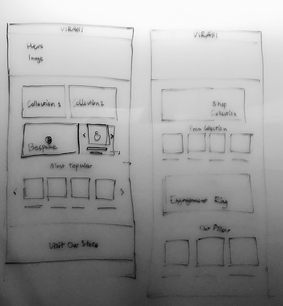
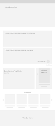


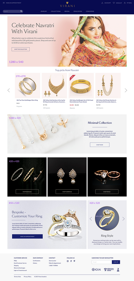
Hi-fidelity Wireframe
Promotion for primary persona
Display collection highlights in static banner to introduce the promoted products.
The product gallery background is an extension of banner image, which unify visual style above the fold.
Collections for secondary persona
Banner in the middle display collection for growing market - less expensive pieces that sells fast.
Three blocks that directly link to the best selling products in luxurious visual style, targeting investors who seek gold value.
Bespoke Service introduction
Bespoke covers two of the important selling points - Wedding rings and customization service.
Slide show on the bottom right gives examples of different ring style and invites shoppers to explore
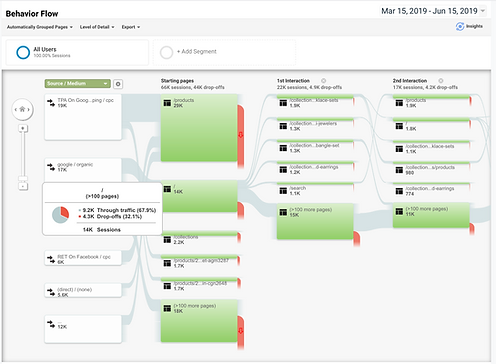
5. Outcome: Improved Funnels
New homepage was launched March 11, 2019, and we've started to see positive outcomes:
-
Lower Drop-Off Rate: Based on Google Analytics, homepage drop-off has lowered by 7.4%, from 37.5% (Sept 2018 - Feb 2019) to 32.1% (March - June 2019).
-
Decreased Ads Spent: in March and April, Google Ad spent decreased to 1/3 of previous quarter, retaining same level of sales record.
-
Effective Funnels: With new homepage, users were funneled to certain collections following Virani's marketing strategy.